When it comes to designing your website, it can sometimes be overwhelming knowing where to start. In a lot of cases, it’s not so much writers block, as being totally overwhelmed with options and ideas!
Colour schemes play a major part in branding, design and (yep, you guessed it) your website, giving would be customers a quick idea as to what your business is all about. You only get one chance to make a good first impression, so it’s massively important that your website fits with your business, it’s ideals and the message you want to convey. Colour plays a big part in this, so it’s no stretch to say that a colour scheme can make or break your site.
But with so many possibilities out there, where should you look for inspiration? How about the retro years?
Our latest guide looks at website colour schemes inspired by retro photography, with codes. We’ve even thrown in a few site design pointers for good measure! Take a look, get inspired and get your site oozing that retro cool.
Here’s The Plug!
If you’re still struggling, get in touch. Using our Web Design In Sheffield will help your business shine, no matter what style your looking for.
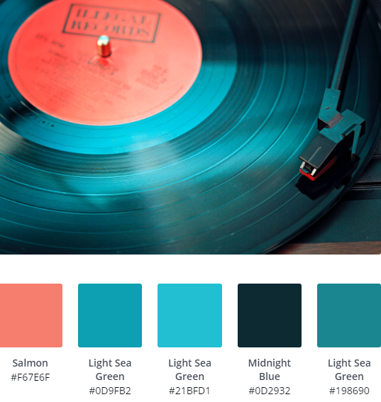
Electric Blues
We love the contrast of electric blues against a dark, Midnight Blue which would work well on any modern website design. Add a splash of colour using Salmon pink on accents and links, coupled with impactful, sans-serif fonts for a bold, crisp website.
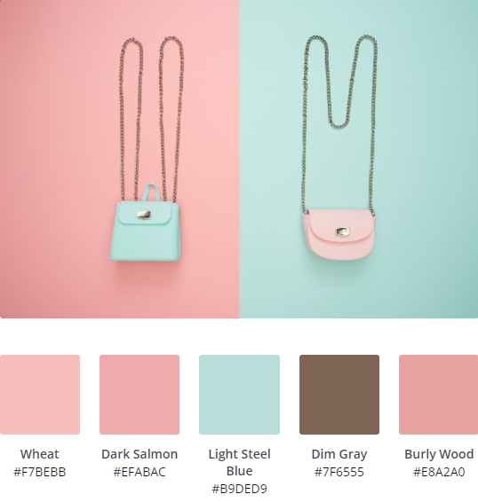
 Pretty Pastels
Pastel colour schemes are a great choice for artisan and creative type websites, adding a softer, personal touch that’s less ‘corporate’.
Use a mixture of pinks and reds, coupled with a soft, Light Steel and a selection of script fonts for an on trend, pretty website. We love this one so much, we’ve used a variation ourselves; opting for a dark grey contrast to make everything stand out.
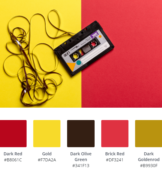
 Clashing Colours
Whilst they may not be everyone’s cup of tea, clashing colours like the Brick Red and in your face Gold can really make a big statement, especially on modern sites.
With such a busy scheme, keep fonts pared back. Opting for heavier weighted sans serifs such as Montserrat Bold will really compliment your overall design.

Bold & Masculine
Blues and dark greys, does it get any more masculine? Seriously though, a muted colour palette of greys and blues will always be a timeless classic, especially if you’re designing a business focused, corporate website.
Here, the addition of Goldenrod adds a little bit more interest and fun.
Font wise, you’ll see success with a major range here, anything serif or sans serif will work. Our pick would be a classic style like Garamond in white, sitting over Dark Slate Grey for an ultra refined look.
 Purples & Pinks
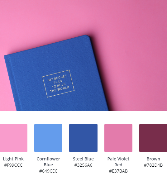
Purples and pinks always work well together and what makes them particularly effective is that they can be used in both light and dark web design projects.
Using Cornflower Blue, Light Pink and Pale Violet Red with a base of white or light grey will give your website a fresh, organic feel. Setting against a heavier dark grey or black on the other hand will help produce a cutting edge, neon inspired website.
 Neon Pinks
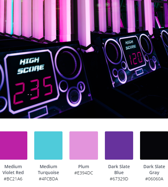
If you really want to step up the effect of your pinks and purples, try some neon style colours!
Medium Violet Red and Dark Slate Blue will really stand out against a dark backdrop, using a clashing Medium Turquoise for maximum, retro neon impact.
Whilst this picture itself might suggest a retro gaming style font will work well (which it will!), you could also try a few script or lighter sans serif options too for variation.
 Vintage Warmth
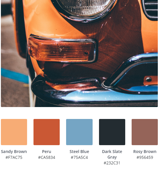
Warm reds and oranges, coupled with some softer blues, white and greys will help create a welcoming, emotive site that oozes vintage cool. Think Polaroid, VW Beetles, Sepia and you’re on the right track.
Using these colours, we’d be tempted to keep a simple white backdrop with unassuming fonts, letting images do all the talking; perfect for an eCommerce or creative site.
 Monochromatic
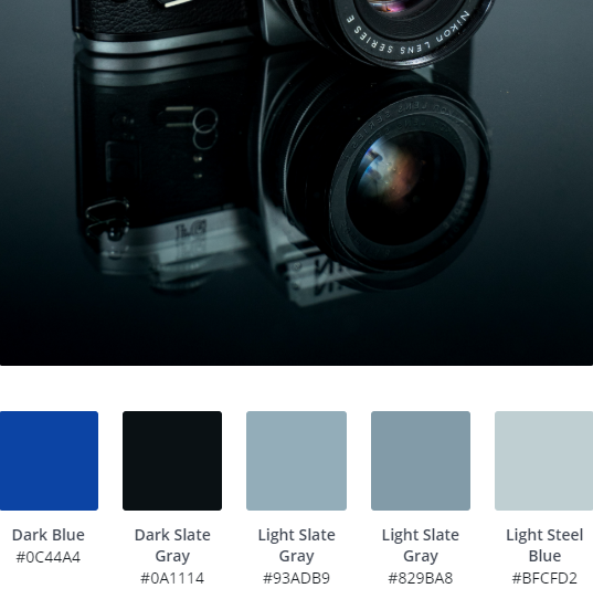
Monochrome web design will always stand the test of time. Using a variation of greys, whites and black will help you achieve a sophisticated finish that’s guaranteed to convey a professional, ‘these guys can be trusted’ feel.
As monochrome is quite all encompassing, there really are no rules when it comes to font choices. Looking for a modern finish, try heavy weighted sans serif fonts over dark colours. Script can be added to soften things up.
 Fresh, Summer Shades
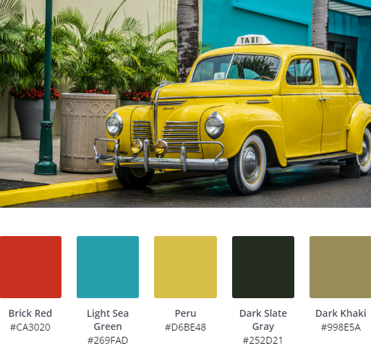
Although some of these vibrant colours could clash, if used right they can be ultra pleasing. The trick is to use eye catching colours like Brick Red, Light Sea Green and Peru sparingly for an effective ‘splash’.
These summer shades are crying out to be coupled with dynamic font styles like Pacifico, perfect for a laid back, easy going vibe.
 Dark & Dusky
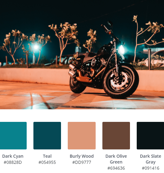
Vibrant shades like Teal and Burly Wood really work well when paired with darker colours like Dark Slate Grey and blacks. We love this sort of colour combo as it lets the content do the talking but still making a big enough design impact on it’s own.
Don’t be scared to mix it up, switching out blues and teals for any colour spectrum you like! Here, oranges and yellows will also work.
Keep fonts more classic. Serif fonts will add a crisp elegance, that contrasts well with the modern tones.
 Orange Burst
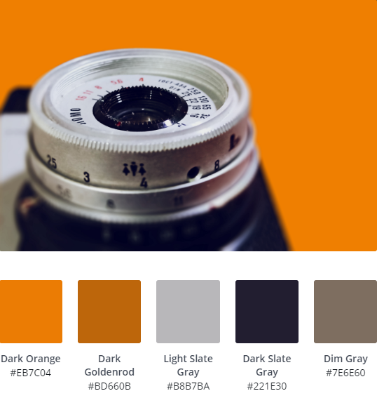
Who doesn’t love orange? If you’re looking for a fresh, eye catching colour scheme for you website, try a standard Dark Orange, paired with a dark blue, or in this case; Dark Slate Gray.
We particularly like this colour palette as the Dark Goldenrod is perfect as a hover colour for buttons and links.
 Organic Oranges
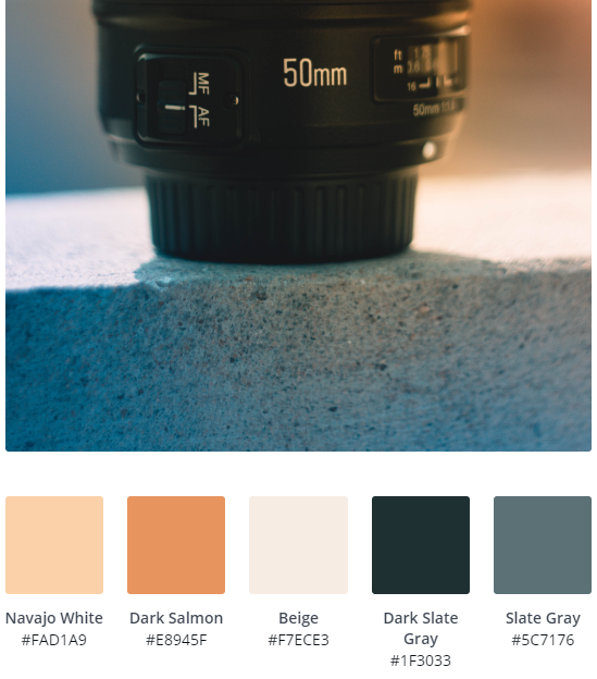
A little twist on the oranges above, this retro colour palette uses softer tones, for a more well rounded, calmer feel.
Again, the contrast of oranges and Dark Slate Gray is what really works here, but the addition of Beige (not everyone’s first choice, right?) really mellows things out.
If you’re aiming for a corporate style, business website, we’d recommend sticking to a serif font.
 Woodland Tones
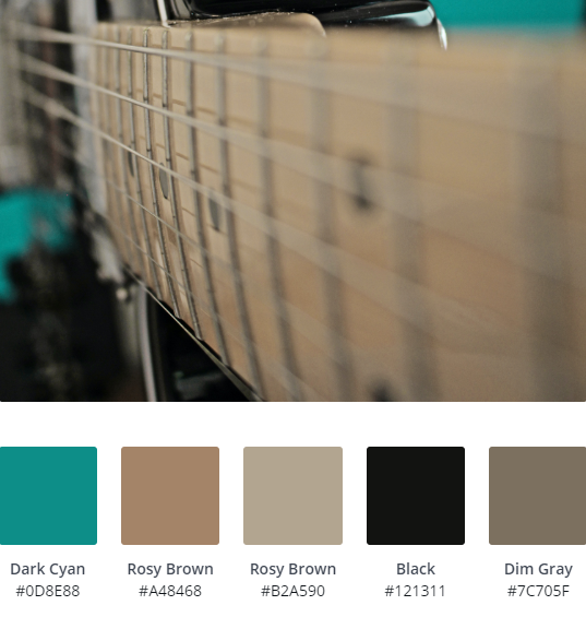
Building a site for an outdoor based business? Using woodland tones, with a modern twist will help convey your message, without being cliched. Our advice is to stay away from the typical dark greens and beige.
This Telecaster image throws up an interesting combination, with Dark Cyan adding a little intrigue. Surf Green or Pea will also work well too. If you need a softer overall finish, think about replacing Black with a dark gray.
Any font style will work with this website colour palette, depending upon your intended overall feel, but think about mixing in whites for easier reading.
 One Colour Contrast (Dark)
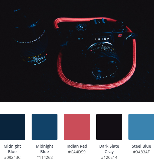
Using one contrasting colour on a dark background, in this case trusty Dark Slate Gray and Indian Red is a quick and easy way to develop an up to date, hard to beat website palette.
We’ve chosen this image to give you some inspiration, but to be honest one colour contrasts work with pretty much anything. In fact, our site is a variation on this, using a nice, vibrant yellow.
When it comes to buttons, use a lighter version of your colour for hovering to keep overall consistency.
Stick to sans serif fonts with this style. Anything from Open Sans to Roboto will do the trick.
 One Colour Contrast (Light)
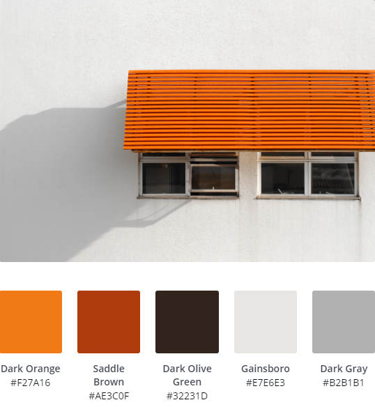
One colour contrast also work well with lighter website colour schemes. Here, orange really ‘pops’ against Gainsboro, but as always with colour contrasting, any colour will work!
Conversely, hover colours should be a darker variation of your main colour to add cohesion on a lighter scheme, with fonts being predominantly serif based, to give a refined, professional look.
 Pretty Pastels
 Clashing Colours
 Purples & Pinks
 Neon Pinks
 Vintage Warmth
 Monochromatic
 Fresh, Summer Shades
 Dark & Dusky
 Orange Burst
 Organic Oranges
 Woodland Tones
 One Colour Contrast (Dark)
 One Colour Contrast (Light)