Website Not Doing What It Should? Maybe It’s This…
Web design can be a fine balance between art and science. When done right, it can captivate your audience, establish credibility, and drive conversions. But when done wrong? It can be confusing, disorienting, and ultimately frustrating, driving your customers away.
Whether you’re creating your first site or giving your existing one a facelift, avoiding common pitfalls is crucial to building something that truly works for your users and your business. Here are some of the most common web design mistakes we’ve seen (and fixed!) and how you can steer clear of them.
The Most Common Pitfalls Of Web Design
Ignoring Your Audience
One of the biggest mistakes in web design is designing for yourself, not your users. You might love bright neon colours and a cluttered homepage, but if your audience is looking for simplicity and professionalism, they’re guaranteed to bounce straight back off your website.
Remember, certain colours, fonts and design features signal to your audience what your business is about. Getting it wrong can convey the wrong message.
Every element of your site—from the layout to the copy—should be tailored to your target audience’s preferences, habits, and needs.
Overloading with Features
A flashy homepage with animations, pop-ups, and widgets galore might seem impressive, but too much can overwhelm users. Instead of engaging them, you risk driving them away.
Your site should focus on simplicity and purpose. Features should enhance the user experience, not detract from it.
Pro Tip: Follow the “less is more” rule. Only include features that genuinely add value and align with your goals. (Think about ‘Pop-ups’; have you ever thought ‘wow, I really love this!’?)
Poor Navigation
Your website’s navigation is its roadmap. If users can’t find what they’re looking for quickly, they’ll leave—no questions asked. Confusing menus, broken links, or too many options can make navigation a nightmare.
We recommend making a physical list of your pages (including both the ones you already have and the ones you plan to use in the future) and mapping them out offline, before creating your website navigation.
Neglecting Mobile Users
With more than 50% of web traffic coming from mobile devices, failing to optimize your site for mobile is a recipe for disaster. A clunky, non-responsive design can frustrate users and harm your search rankings.
Pro Tip: Use responsive design to ensure your site works seamlessly across devices. Test on different screen sizes to catch any issues early. If you need help, consider our Mobile Friendly Web Design.
Slow Load Times
In the digital world, speed is everything. If your website takes longer than three seconds to load, you’re already losing visitors. Large image files, poorly optimized code, or excessive plugins are common culprits behind sluggish load times.
Compress images, minimise unnecessary scripts and use tools like Google PageSpeed Insights to monitor and improve your site’s performance. We’re also a big fan of GT Metrix too, a more in depth tool (which has limited free usage) that outlines your website performance.
Forgetting About SEO
A beautifully designed website is useless if no one can find it. Many web design projects overlook the importance of SEO, leaving sites buried in search engine results.
From poorly structured URLs to missing meta tags and slow-loading pages, bad design choices can sabotage your SEO efforts.
Although you’ll probably not reach position 1 on Google Serp’s overnight, a good SEO structure on your website can help from the get go.
Inconsistent Branding
Your website is often the first interaction someone has with your brand, so consistency is key. Clashing fonts, mismatched colours, and unclear messaging can confuse visitors and damage your credibility.
Pro Tip: Use a style guide to maintain consistency across your site. Stick to a defined colour palette, typography, and tone of voice. We have plenty of design inspiration in our blog, including 11 Website Colour Schemes Inspired By Sheffield
Weak Calls-To-Action (CTAs)
A beautiful site is useless if it doesn’t convert. Failing to guide users toward your desired action—whether it’s signing up for a newsletter, purchasing a product, or booking a consultation—is a missed opportunity.
Make your CTAs clear, compelling, and easy to find. Use action-oriented language like “Get Started” “Claim Your Offer” or “Contact Us Today”
Neglecting Regular Maintenance
Even the best-designed websites need upkeep. Neglecting updates can lead to broken links, outdated content, and security vulnerabilities.
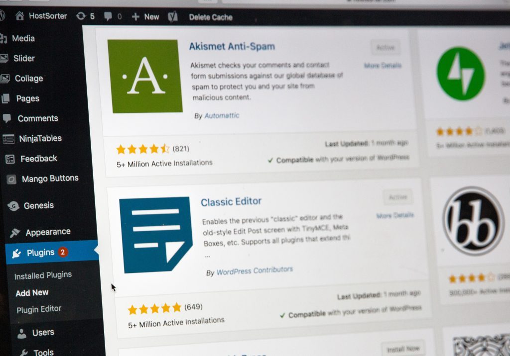
Schedule regular site check-ups to keep everything running smoothly. Update plugins, fix broken links, and refresh content to stay relevant. If you’re using WordPress this is pretty simple, just head to Dashboard> Updates.
The Wrap Up
Avoiding these pitfalls can mean the difference between a website that converts and one that crashes. Building a site that works takes time, effort, and a user-first mindset, but the results are worth it.
Not sure where to start? Get in touch! We’ve helped countless business in designing websites that look great, perform even better, and avoid these common mistakes. Contact us today and let’s create a website that works for you.
Found this helpful? Share it with your network.


