When it comes to designing your website, what better place to take inspiration from than gods own city itself? Our latest blog looks at colour schemes inspired by Sheffield, along with font ideas to help you find the perfect theme for your new site.
We’ve even included colour codes and a few design pointers for good measure. So if you’re looking for site inspiration from our very own seven hills, read on!
Here’s The Plug!
If you’re still struggling, get in touch. Our web design services will help your business shine, no matter what style your looking for.
 Regal Mix
 Regal Mix
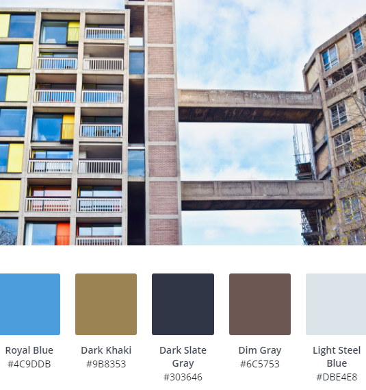
There’s no way we couldn’t start with Park Hill Flats! Here, the obvious Canary Yellow has been left out in favour of Royal Blue and contrasting Dark Slate Gray which works well against Light Steel Blue to create a rich, regal style.
Consider using Dark Khaki as an accent, maybe as button borders or hover colour for an extra layer of interest.
We’d use light weight Serif fonts here, such as Garamond or Cormorant.
 Warm Mediterranean Blue & Orange
 Warm Mediterranean Blue & Orange
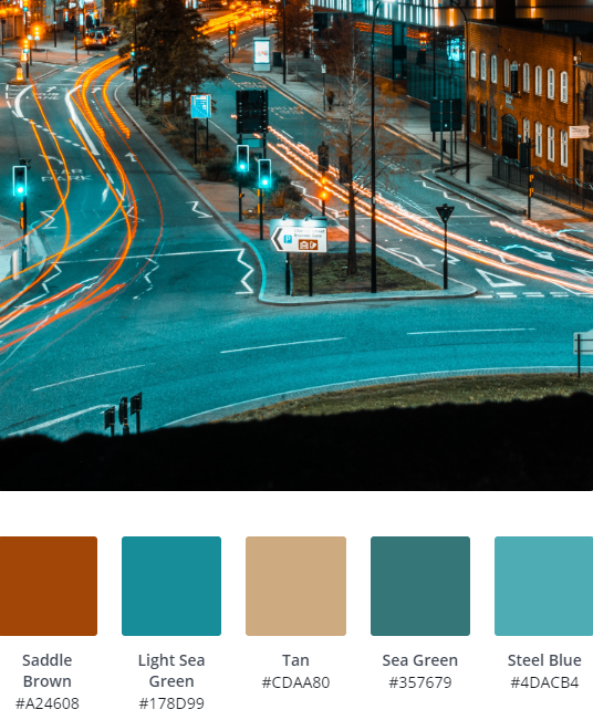
If you’re looking for a website colour scheme that’s a little more exotic, try a mixture of blues paired with warm Saddle Brown. We’d use a white or soft gray background as a base, which would really help those warm colours to pop.
Try a heavy, sans serif font such as Futura PT, which is modern enough to pull this colour scheme into the modern day. Avoid traditional fonts with this scheme, otherwise you’ll end up bordering on the theatrical.
 Monochromatic
 Monochromatic
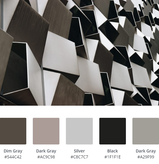
What colour scheme is complete without a standard monochrome palette?
Here, the Cheesegrater, gives us some great ideas for a simple, Gray based scheme, including a Dark Gray, with Silver and Black. Consider adding in a cold, Blue/Black in place of black for a ‘less harsh’ feel.
Font wise, you can’t really get it wrong with monochrome, Open Sans is a nice, simple font that compliments the scheme well.
 Winter Blues
 Winter Blues
Cooler blues are some of our favourites for web design, especially for corporate sites, as they convey trust and work across pretty much any brand and tone.
Here, Steel Blue is the stand out colour, which should be used as the main accent, with Midnight and Dark Slate Blue acting as the base. If you’re looking for an eye catching contrast, consider adding a copper, burnt orange or gold for button borders and link underlines.
Garamond and Playfair Display would be our go-to fonts here, although some quirky display fonts such as Squada One will also throw up some interesting pairings.
 Single, Standout Colour
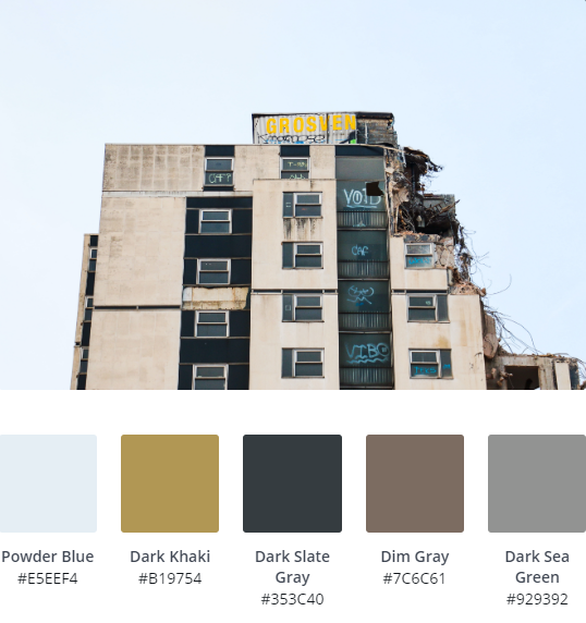 Single, Standout Colour
Using a muted palette with a single, standout colour is a tried and tested method of creating impact. In this case, Dark Khaki is the main man, but you could easily switch this out with a lurid lime green or more vibrant yellow.
The key with this colour scheme is to design your website around the Dark Slate Gray and Powder Blue, essentially, creating a monochromatic design; which lets the single colour sing.
Use Dark Khaki as button borders and individual splashes for backgrounds where you’d like to draw the eye, such as your call to action rows. In fact, this theme is pretty similar to ours!
Obviously, we’ve got to recommend Montserrat, mixed with Bold and Light variants, simply because that’s what we use!

Heritage Blues
Heritage colours are usually a little warmer than most, which makes them a perfect choice for inoffensive, cover all sites, such as tourism and professional service sites.
Two versions of Dark Slate Blue form the base of this scheme, which should be build upon a light gray or white background, with Cadet Blue and Steel Blue contrasting with Dark Gray to add a little more interest to the overall scheme.
We’d use a serif font here, such as New Roman, or a simple, Open Sans, sans serif to keep things simple.
 Basic & Impactful
 Basic & Impactful
Sometimes, it pays to keep things simple. In this scheme, inspired by West Bar and Pete McKee’s glorious ‘The Snog’ on the side of Fagan’s, a simple Brick Red is the real hero, showing that you can get away with basic colours every now and then.
This theme isn’t for everyone, if used incorrectly it will look dated, straight out of the box, our advice; be bold. Use the red as a base, along with Dark Slate Gray and Peru, to create an eye catching, punchy site.
Keeping text to a minimum is key, which makes this scheme ideal for creative sites. If you do need some font ideas, use Montserrat or Nunito, which are pretty pared back.
 Soft Reds
 Soft Reds
Sometimes using limited colour can really pull a theme together; that’s the case with these vivid reds. Using Brown and Indian Red, contrasting with ultra 80’s, retro Light Slate Gray and Slate Gray will really work well on any graphic based, low on copy site design.
We’re recommending heavy, sans fonts for this one, such as Futura or PT Sans. You could also play around with font weights to change things up a bit.
 Smooth Desert Tones
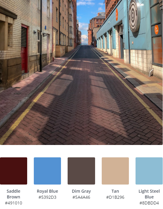 Smooth Desert Tones
One of our personal favourites, these soft, desert tones of Tan, Dim Gray and Saddle Brown, paired with Light Steel Blue and Royal Blue really deliver some chic vibes.
You’ll probably need a white base colour for this scheme, using the Royal Blue and Saddle Brown as contrasting main colours, using Light Steel Blue as accents such as on button hover for example.
Font wise, most pairings will work with this pretty inoffensive scheme, but keep weights nice and light.
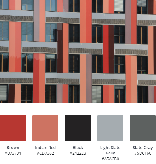
 Crucible Steels
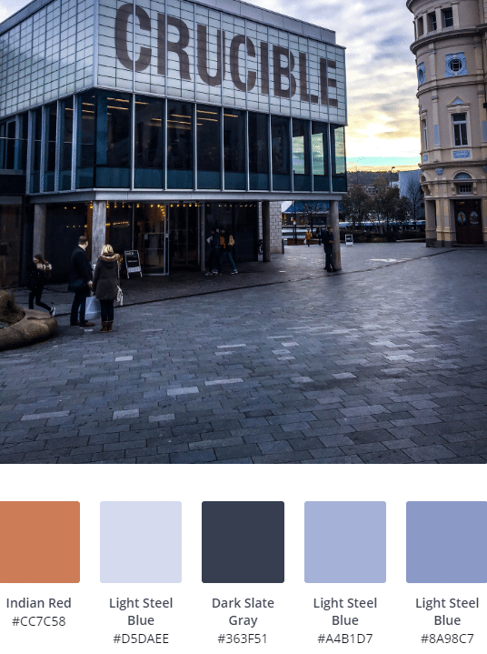 Crucible Steels
Possibly the most versatile colour scheme on our list, this Crucible inspired mix of Light Steel Blues and contrasting Dark Slate Gray is an absolute winner. Add in a splash of Indian Red (or a Lime Green if you’re feeling fruity) to really make key elements sing.
If we were using this scheme, we’d think about keeping Dark Slate Gray as our header colour, playing off menu links in Light Steel Blue, darkening on hover, with the current page in Indian Red.
Building a site that needs to be a little conservative? Roboto or Lato style fonts will deliver.
If you’re looking for something a little more fun (and this scheme can take it, depending on your use of the Red) be daring! Fredoka One will set the cat among the pigeons.
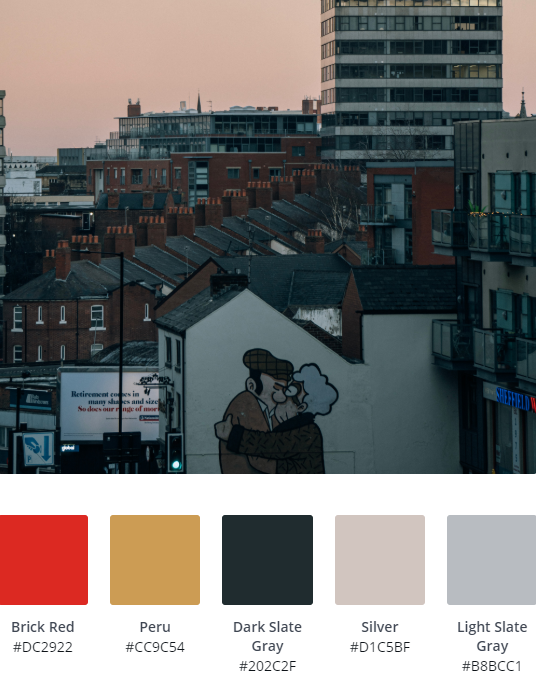
 Formal Blues
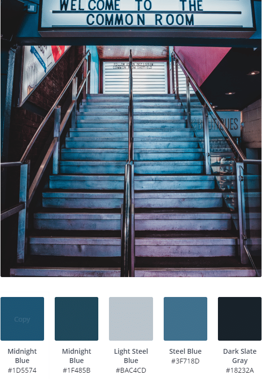 Formal Blues
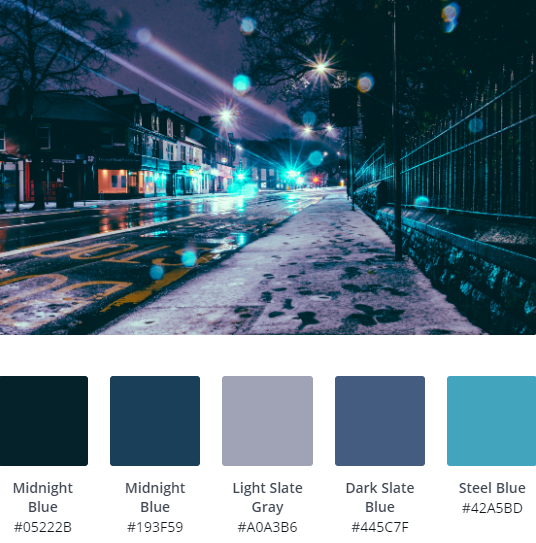
These colours, inspired by the well trodden stairway of The Common Room are a tried and tested mix of blues that will probably be your new best friend. Most websites work well with these blues; Midnight Blue, Light Steel Blue and Steel Blue, which you’ll probably use again and again over time.
Both sans and serif fonts will work with these colours, we’d be inclined to go with Poppins or Oswald, which are sharp and uncluttered.
Working on a site that can afford to be a little more entertaining? Don’t ignore the splash of Fuchsia which makes this picture so inviting! A contrasting pink against the blue will really stand out!


