A lot of businesses these days are looking for ‘elegant’ websites, which ooze cool, sophistication, chic and any other fancy buzzword you can think of. The problem is, how do you define ‘elegant’, or ‘classy’? With so many interpretations on the table, it’s sometimes difficult to get the vibe right on your website; often moving from one idea to the next, ending up with a mish-mash of pretty good ideas, that don’t really come together.
Why not look to success stories for inspiration? High end brands have already nailed it when it comes to conveying elegance and modernity, so it’s worth taking a leaf out of their book! Think Rolls Royce, Aston Martin, Rolex and the like, if you can get even half as much style into your web design, you’re onto a good thing.
In our latest guide, we’re taking a look at some on trend, high end website colour schemes, inspired by luxury brands. Don’t worry, we’ve put some design tips in their too, so you’ll soon be on your way to making a site that’s posher than the Queen’s solid gold carriage.
You didn’t think we’d miss our self promotion did you?
Hit us up for Web Design In Sheffield. We can make any business look cool.
 Earthy Tones
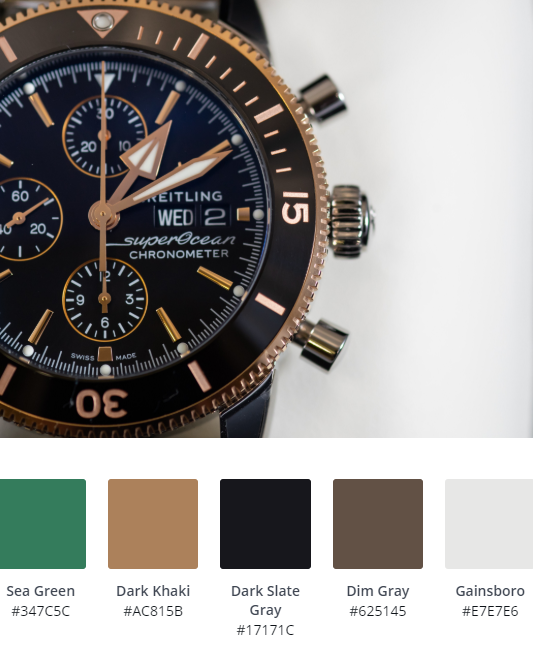 Earthy Tones
Our takeaway from this colour scheme is definitely the subtle use of Gainsboro, to add a touch of sophistication which wouldn’t be achieved with a harsher white.
Sea Green and Dark Khaki are a classic combination of earthy tones that will bring a touch of class to any organic based website.
We’d recommend using sans serif fonts with this scheme, to avoid the whole thing becoming a little dated. Consider sharper fonts like Roboto and Poppins to bring a crisp finish to your website.
 Sunset Blues
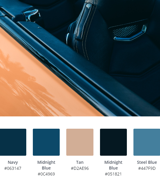 Sunset Blues
We love the laid back tones in this colour scheme, which would work on plenty of corporate business websites, with the Steel Blue and Midnight Blue contrasting well against Tan.
Using this design, we’d be tempted to make buttons and hover switch between Navy and Midnight Blue to tie the whole thing together.
Font wise, anything would work, depending upon the feel your going for. Elegence? Stick to lighter serif fonts like Garamond or Playfair. If you’re looking for something a little more modern or corporate, try a sans serif, but stick with light weights.
 Classic Heritage Colours
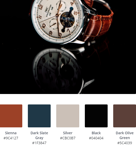 Classic Heritage Colours
Sienna and Dark Slate Gray are a great alternative to standard reds and blues that will elevate your website into the next bracket. Using these softer tones, base your entire site on Silver or a soft white (like the Gainsboro we mentioned earlier) for a vintage, 50’s feel.
Josefin Slab would be a good option here font wise, it’s a little more ‘out there’, we’d even consider mixing up two fonts for headers and body text. This will help keep your web design scheme looking up to date.
 Urban Greys & Yellows
 Urban Greys & Yellows
Let’s face it, grey is here to stay. It’s already a popular colour choice for web design because it’s easier to convey a modern image. We’re big fans of monochromatic colour schemes, especially if they’re paired with ‘in your face’ colours too.
Here, Dark Goldenrod and Khaki contrast well with the darker colours to create an edgy, up to the minute colour scheme, but this would also work well with bright oranges, electric blues or lime greens.
The trick with this colour scheme when designing your website is to keep the layout sparse; don’t go overboard with images and text, not great for SEO we know, but this one is all about looks.
Pair with heavy, spaced fonts like Montserrat or Anton to increase the impact statement.
 Sophisticated Pinks
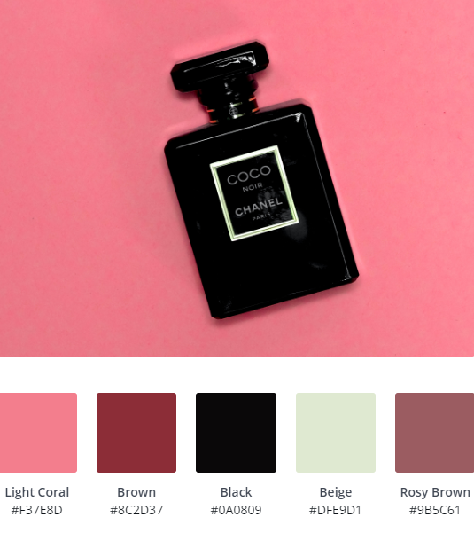 Sophisticated Pinks
Beige, Light Coral and Black will always work, giving off 1920’s glamour vibes. We’ve included this colour scheme to show that elegance and luxury doesn’t always mean bland. Use a contrast of soft colours against a heavy backdrop like black or dark grey for a striking, timeless website.
The obvious choice for fonts here is definitely a lightweight, wide sans serif like Raleway.
 Steel Blues
 Steel Blues
Another colour scheme perfect for a corporate website, the combination of Light Steel Blue and Light Steel Gray is unassuming without being boring and the Dark Slate Blue adds interest, as well as conveying trust to would be customers.
This scheme would work well for a number of company websites from Architecture to Accounting. Mix with sharp, sans serif fonts to keep a modern feel.
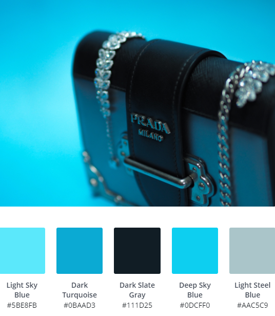
 Ice Blues
 Ice Blues
Another blue colour scheme, which will work on most business sites, this time offering something a little fresher, which could also work on eCommerce. Light Sky Blue, contrasting with Dark Cyan will really help give your site a sense of fun, whilst still maintaining that cool, fashionable feel.
We like this scheme in particular as the choice of backing colour will totally change the feel of your site. Choose a Lavender or Light Gray page colour for a fresh, welcoming look, opt for Midnight Blue for a sharp, masculine feel.
Font wise, a sans serif will stop your site from feeling dated, especially against the more traditional blues. If you’re looking for something even more free flowing, try a script.
 Contrasting Vibrant Colours & Black
 Contrasting Vibrant Colours & Black
This is the last blue heavy colour scheme we’re featuring (honest!). We had to include this one though, as it’s a good example of how striking a palette can be when almost clashing vibrant colours against a backdrop of black.
This scheme will work well on any modern, minimalist site, looking not too dissimilar to LinkedIn, which is the epitome of professionalism. If you want to mix things up, maybe blue isn’t your thing, try switching out different tones, but keep them sharp, bright pinks and vibrant yellows will work too.
Rounded fonts will soften things up a bit, Varela, Exo or Archivo are all good options.
 Warm Heritage Colours
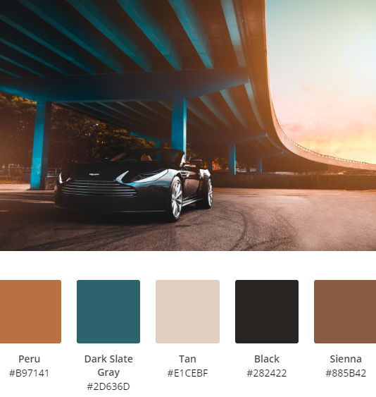 Warm Heritage Colours
Quite possibly our favourite website colour scheme on the list. Peru and Sienna aren’t obvious choices when it comes to websites, but combined with Dark Slate Gray and Tan, they’ll work perfectly for masculine brands, such as men’s fashion and eCommerce.
Whilst there are plenty of variations on using these colours, as most of the colours will work well in any position on a site; we’d be tempted to use Dark Slate Gray as a header, with Tan and Peru accenting in places, such as buttons and menus.
Keep fonts serif and traditional to emphasise the luxury feel.
Subdued & Vibrant Colour Mix
 Subdued & Vibrant Colour Mix
This colour palette works as theirs a backdrop of subdued colours and one, key vibrant colour; in this case Brick Red.
Use Medium Aquamarine, Cadet Blue and Light Grey as the staple of your website, mixing in Brick Red (Bright Orange could work too) to add some life, drawing people to important parts of your site.
 Neutral Tones
 Neutral Tones
Outdoor businesses and anything that wants to convey an ‘organic’ message can make use of an organic colour scheme on their website. If you’re using this palette, we recommend a light background such as white, with blocks of Beige and Rosy Brown. Use Steel Blue on key areas of your site to really draw attention to them.
Looking for something rich and sophisticated? Mix it up, using Dark Olive Green as the main header colour and serif fonts in white or Beige to contrast.
A website using this colour scheme would benefit from a strong serif font such as Baskerville or Rufina.
 Pure Monochromatic
 Pure Monochromatic
Using a limited, monochrome colour scheme is always a good idea for any website, regardless of target audience. Firstly, they lend themselves well to good content, as they don’t detract from text and images. If you’re thinking of building your site in monochrome, think about going big on your layout; full size hero images, that sort of thing.
We lean towards heavy fonts like Futura but for proper timeless design, stick to staples such as Open Sans or PT Sans.
TIP: If you’re using a monochromatic scheme for your website, try Google’s Flat Design Colour Generator, it will always throw up something that works!
 Metallics
 Metallics
Metallics are definitely a rising trend with web design and branding, with people looking to go back to basics in pursuit of a quality feel, we’re all for it. In fact, when our client; Simply Siam asked us to create something refined for their site, we used a similar palette.
Goldenrod and Burly Wood work well here when contrasted with Light Blue Steel, but you could also try a range of silvers, coppers or bronze. Just remember to stick to one!
Serif fonts, nice and light-weight will really set this style off (we used Cormorant Garamond on Simply Siam).
TIP: Avoid having a colour change on button hover to keep that refined feel.
Vibrant Reds
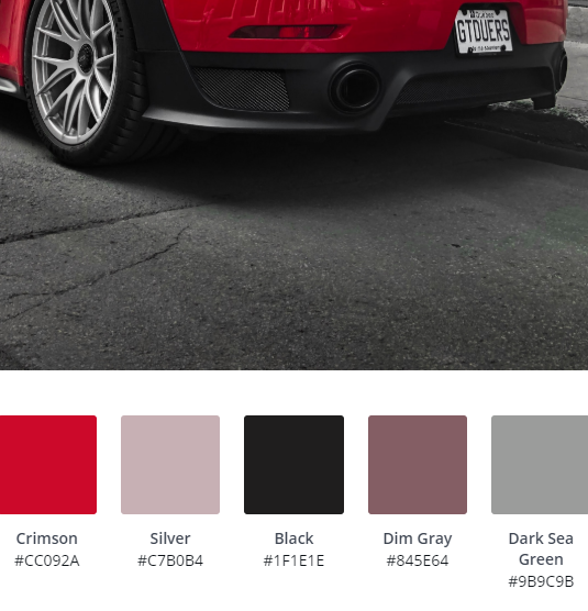 Vibrant Reds
Reds, like this vibrant Crimson and softer Dim Gray should be used with caution, they can sometimes give off an 80’s vibe. If you get it right though, your site will really stand out! Keep your design pared back, with minimal fuss, so your site colour scheme can sing.
Sans serif, heavy set fonts for headers and lighter sans serif fonts all the way on this one. Keep text black or white, depending on your backdrop, oh and avoid setting text on Crimson.
 We Lied About The Blues
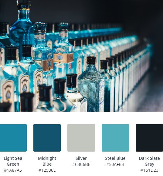 We Lied About The Blues
Ok, this is definitely the last blue theme! We had to include it because, who doesn’t love gin?
Steel Blue and Light Sea Green lean towards the greener end of the scale, so if other blue colour schemes are a little too cold for you, this will work. If you’re using this palette to design your website we recommend Midnight Blue and Silver as alternating background colours, which work well on modern row and block based websites such as WordPress.
A clean, serif font such as Rufina in white will really pull your website together, maybe with an Open Sans font for headings.


